You may have noticed the Plenty of Fish app looks a little different these days – perhaps a little better, brighter and bolder? That’s because we’ve updated the app (Android and iOS) to make your experience much easier and more enjoyable! Now, we know change can be hard at first, so that’s why we’ve written this helpful post about the updates we’ve made and the best way to navigate the new Plenty of Fish app.
Out With The Old and In With The New
Being one of the early pioneers of the dating industry, the Plenty of Fish app was starting to hint at our age. Once referred to as “vintage,” it was time we address your feedback and update the app to provide a fresh, and seamless experience.,
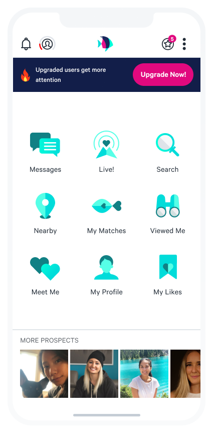
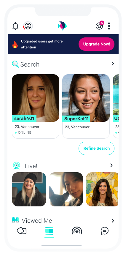
You’ll notice immediately, the new “explore tab” on the Plenty of Fish app is more organized and provides big, bold images of other singles right away so you can see who’s available to chat in your area without tapping in and out of each list. A huge change from seeing a full screen of ambiguous icons like before. You can also simply tap on each of the headings and be taken directly to the lists of other members.
You can refine your search by tapping the Refine Search button right below the search results. Refine Search allows you to tailor your matches by different criteria such as age, relationship intent, education, height, lifestyle habits and more.
“Like” Anyone from Anywhere
Another bonus we’ve added into your experience is you can “like” anyone from anywhere in the app. All you have to do is tap on their image and click the heart icon, or you can make the first move and send them a message right away. You will also find this heart icon in many of our lists, making it faster to express interest. When you “like” someone, they will be added to your “My Likes” section and the person you liked will be notified that you liked them.

Check out Plenty of Fish Live!
Scroll down the “explore tab” and you’ll find what Plenty of Fish members are currently livestreaming on Plenty of Fish Live! We rolled out this new feature in March to provide singles a way to connect and stay social while staying at home. Live! Is available to all global app users and it’s entirely free. If you haven’t tried Live! yet, we highly recommend you do. Every Thursday and Saturday evening at 7pm PST / 10pm EST until the end of May, we’re hosting speed dating hours where you can meet new singles and win prizes! You can find out more here.
In the video, you’ll notice, you can keep scrolling and see what members have Viewed You, are Nearby, your Chemistry Matches, your list of Likes, and Recommended Matches selected by us.
Where are all of the other lists, such as Ultra Match, Chemistry Matches, Events, Who I Viewed, First Look, and Username Search? Each of these lists live underneath other lists and are available with a tap, just like before. You can access First Look and Username Search by tapping on the Search heading on the explore tab, Ultra Match and Chemistry Matches by tapping on the My Matches heading, and Events by tapping on the Nearby heading.
Helpful New Icons
And what are these four new icons on the bottom navigation bar you ask? Well, they represent – Meet Me, Explore Tab, Live! And Messages. Here’s what each of these icons will do for you:
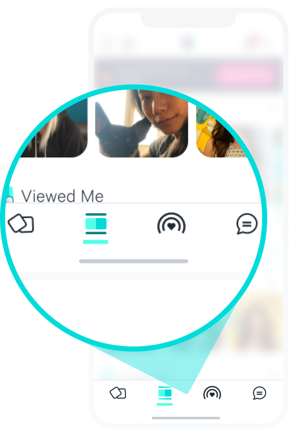
Meet Me is where you can give other members a check mark if you “like” them or an X if you’re not feeling it. If you give another member a green check mark, they will be notified. You can also check out the list of people that have liked you or with whom you’ve both liked each other by tapping “Liked You” and “It’s Mutual” on the top of this screen.
Explore Tab will take you back to the updated app experience.
Live! will show you all the top streamers on Plenty of Fish Live! and you can dive into anyone’s streams and start watching and engaging.
Messages will take you to your new messages received by other members.
Still wondering where your profile is and how to edit it? Easy! We’ve placed it on the top navigation bar with the profile icon to the left.
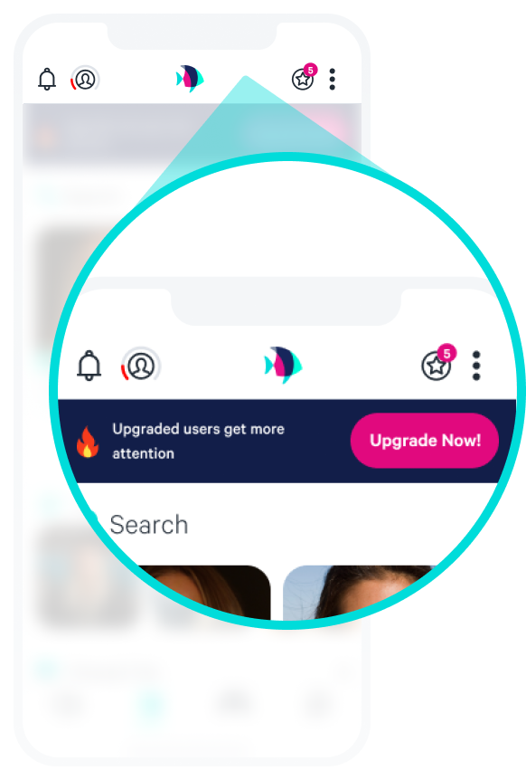
Just simply tap the icon and you will be taken into your profile where you’ll see three easy buttons at the bottom where you can edit your photos, see your current ones and edit your entire profile.
Hot Tip: When you go into your profile, your “about me” looks like it’s been cut off abit, you can click the down arrow to see the additional paragraphs on your profile when you’re in profile view.
What is it missing? What makes it better? What makes it worse? We would love to hear specific feedback from you – please leave your comment below this post, or reach out to us directly at [email protected].







6 comments
Hi – I keep getting matches sent that are way too young for me. Is there any way to change that? I am not an upgraded member.
Hi Isobel, you may want to take a look at filtering through your Mail Settings option! If you got your profile, you can select Preferences and you will see you can select an age range within these preferences! This should help you out.
Where is the “viewed me” “who I viewed” section on your new app, its gone
Hi Meagan, thanks for reaching out! The “viewed me” section is an upgraded feature on the Plenty of Fish app!
What’s the difference between the check and the heart on a profile?
Hey Meredith, if you’re referring to MeetMe the green check is a “Yes” and the heart is a Like!